Smart Home Dashboard
ROLE
UX/UI Designer
TOOLS
Figma
Miro
Blackboard Collaborate
DURATION
April 2021 — May 2021 (4 weeks)
SKILLS
Ideation, Sketching, Wireframing, Competitive Market Research, Prototyping
Introduction
Welcome to one of my favorite and most challenging projects to date, the Smart Home Dashboard! Before my deep dive into smart home dashboards, these devices were completely new to me. It’s so much fun to learn new things! This was the capstone project in my Visual Design class. It was also the project that made me realize that with enough time, effort, and hard work, I can do anything. Please enjoy!
The Challenge
How might we create an information-rich dashboard to handle a variety of users’ needs without sacrificing functionality and design?
How might we make it different from options already on the market?
My Goals
Information-rich without sacrificing design
Identify & prevent pain points in the current market
Flexible system that can handle a variety of users’ needs
Insights from the Discovery Phase
1. The best smart home devices:
connect all of your smart devices so they work together
use “if, then” processes (for example: If leaving the house, then lights will turn off, temp goes into eco mode, and security system turns on).
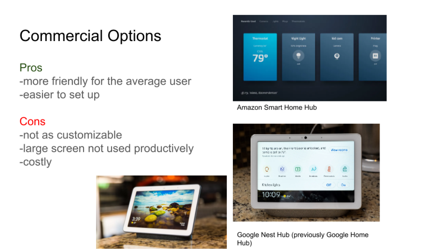
2. There’s a huge rift in the smart home market! Users and products vary wildly. There are:
tech-savvy users who want to build and customize their own interface (without much regard to visual design)
vs.
consumers who want friendly tech that practically works straight out of the box
Areas I Focused On
Combining Strengths
I sought to combine user friendly, out-of-the-box capabilities of the commercial side of the market with the open-source customization and pre-existing community of tech-savvy user-build customers.
Widgets
Widgets display information at a glance, which is what we need for an information dashboard. Unlike apps, widgets are always running and don’t need to be opened to access the content.
Grid System
Users are already familiar with modular grid systems, as seen on mobile and tablet for app organization. This will allow for easier coding and an organized layout.
Sketches & Wireframes
I love sketching and making notes, especially at the beginning when a flurry of ideas rush to me. I go back to sketching whenever I need to get ideas out quickly.
“Your smart home should fit you- not the other way around.”
My initial thoughts were focused on the capabilities and constraints of the dashboard device:
Could it be detached from the wall and carried around?
Or would it stay attached to the wall, and users could use an app to connect to it instead of getting up?
These would affect the distance at which the user would interact with the dashboard, the intensity of light needed, and how large the content would need to be, and whether the user would need to see it from across the room.
After I made the decision to use widgets for an easily-accessible and constantly updated interface, the grid system easily fell into place.
My next thoughts were, how can I fit all the info needed into the main screen? Ideally, the user could easily complete different actions from this main page.
Wireframe (version 3) with Visible Grid. Notice the section with Wake, Sleep, Date Night, and Leaving. These indicate groups of smart home actions the user can preset and customize.
Wireframe (version 3) with Annotations
My thought process behind the lights system was that orange would represent “on” and the lighter color would represent “off.” However, this gray could be confused as a disabled button, so I went with an off-white instead.
Here I tried a side menu because I thought it might be easier for the user to conceptualize which page they wanted to be on, but ultimately tabs were more clear and concise as the navigational tool.
Check out the Final Mockups!
The home page, featuring A/C and heat controls, customizable preset actions (Wake, Sleep, Leave), music controls, calendar widget, and a quick view of the security cameras.
The speakers page, again with presets for specific interactions like turning the lights down low for movie night. Users can see additional music settings here, as well as change volume on individual speakers.
The lights page, which features customizable presets to control multiple lights at once. Users can also switch lights on and off individually and by room.
The security page, which will vary with each user and the level of security available to them. For example, this user has 4 cameras, with the most recent movement showing as the largest screen.
Meet the Prototype
If I had More Time…
I would jump straight into user testing. Ideally, if there was more time for the project, user testing would have come earlier once the first or second version of the mock-up screens were finalized. Even though I put lots of effort into researching the pain points of different types of customers, I don’t have first-hand knowledge on smart home dashboards and my design combines things that I’ve seen from the market. User testing is so important!
Main Takeaways
This project made me realize that no matter how overwhelming something might seem at the onset, with enough time, effort, and hard work, I can do anything. Since this project, I’m able to more confidently go head-first into the unknown.
This also reaffirmed that I love a good challenge. Working on a device outside of typical desktop and mobile was exciting! I want to look more into areas of work and industries that don’t have an immediate or “right” answer, like virtual and augmented reality devices.


